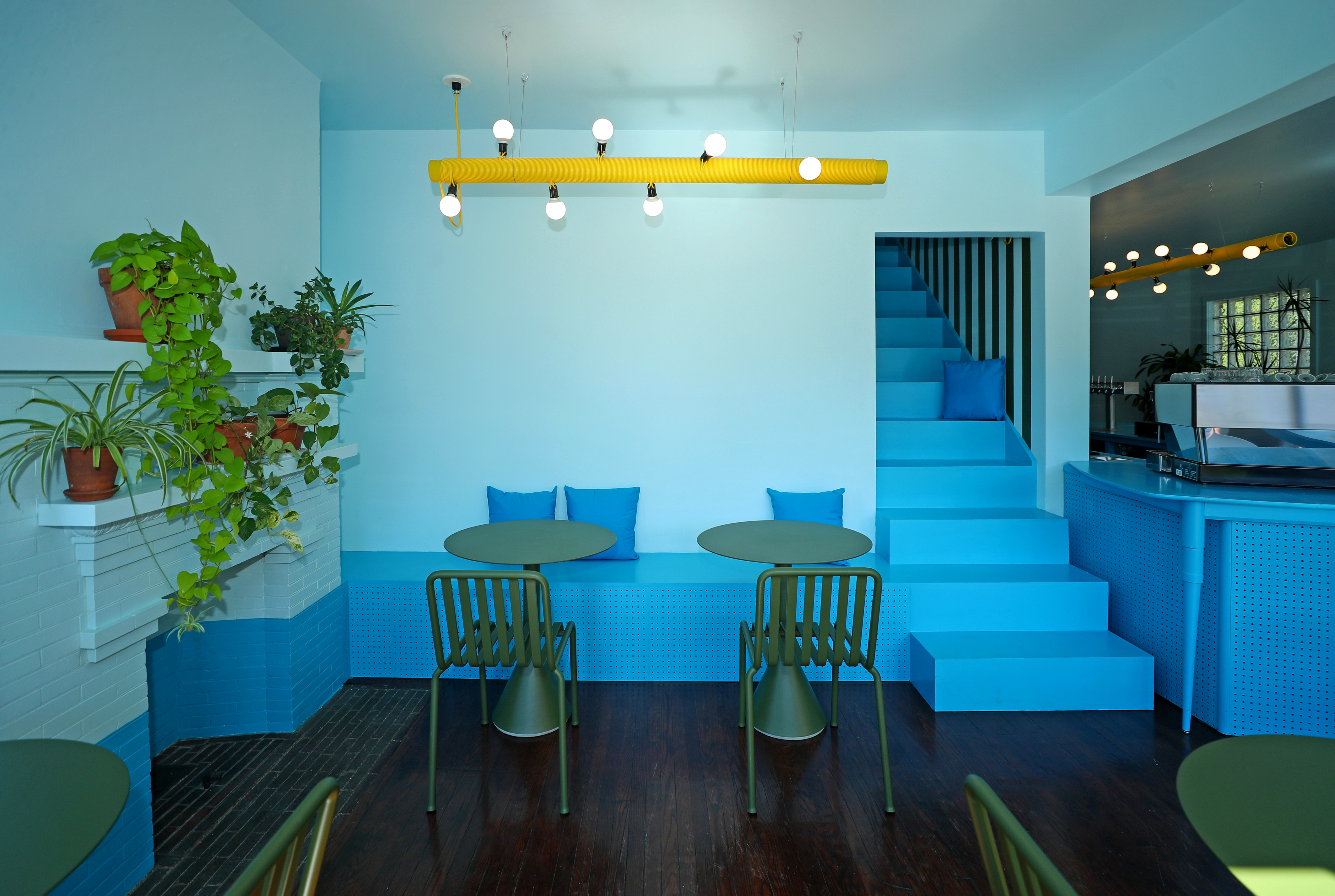
To transform a house in Buffalo into a coffeeshop, design studio CKJJ harmonized the interior in shades of blue, green and yellow. Photo: Sara Schmidle
“Colour does not only add a pleasant quality to design — it reinforces it,” said early-20th century painter Pierre Bonnard; a claim that rings truer today more than ever.
Spend time on any social media channel covering design and architecture and it is impossible to miss: Colour is everywhere. More than ever, buildings, public art and interior walls, floors and ceilings in commercial and residential environments now radiate with multi-hued treatments in calming shades of watermelon pink and milky orange.
These joyful bursts of colour are in stark contrast to minimalism’s hue-light appeal that has reigned for decades. In North America particularly, colour has mostly played a peripheral role, acting as a decorative accent to the otherwise uniform aesthetic of natural wood, stone, steel, and glass.
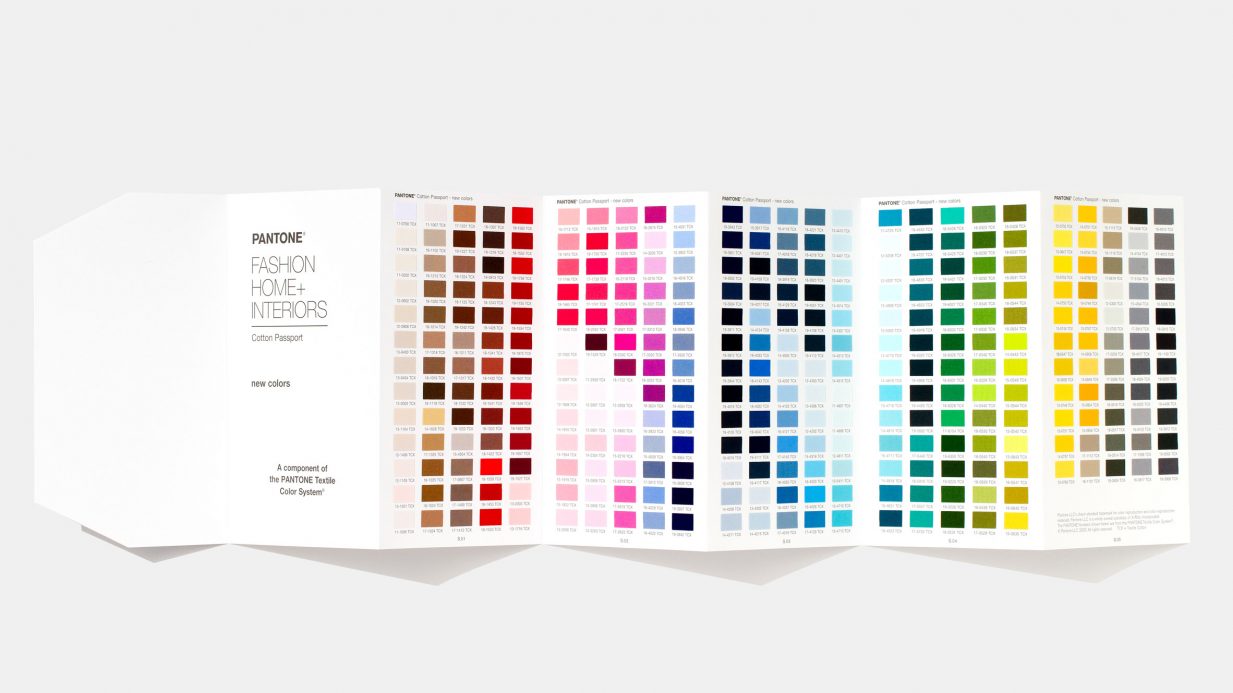
In March, another 315 colours were added to the Pantone Color System. The new additions allow designers to select from an encyclopedic spectrum of 2,625 colours.
The pandemic’s stay-at-home orders may have something to do with the renewed interest in bolder shades. After all, with fewer places to go, finding ways to re-engage with our living spaces has led to a significant increase in home renovations and a desire to personalize our interior lives. In early March, the Pantone Color Institute announced it had added 315 new hues to its roster, including 50 shades of pink and 70 tones of blue. According to the paint company, which wields incredible trend-setting power in almost every sector of design – including fashion, architecture and technology – the beefed-up spectrum responds to “changing societal views” happening around the globe. Such refined nuances in tone, tint and shade suggest, too, that individual expression over brand loyalty has begun to take hold.
In the furniture and interior design sectors, secondary and tertiary hues have been popular for a while. European designers like Hella Jongerius and Patricia Urquiola have been at the top of their game for years, creating sophisticated chromic fusions and inventing “unstable colours” as Jongerius refers to them – a term she coined to describe unique hues built by combining paints rather than sticking to premixed chips offered by companies like Pantone.
Canada’s embrace of colour has been comparatively slower, but our normally reserved tastes are changing. Division Twelve, a company that specializes in powder-coated bent-steel furniture, has featured bold shades since it launched in 2017. Now a subsidiary of Keilhauer, its 2020 collection of chairs, tables and stools is available in 21 colours, including mint green, antique pink and telemagneta.
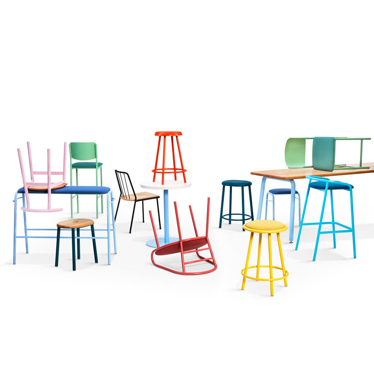
Canadian furniture brand Division Twelve is all about adding hits of bold colour to interior spaces. Photo courtesy of Kielhauer
“It is an ambitious investment,” says Keilhauer’s VP of Marketing Meghan Sherwin, “because you have to order the paint whether it gets used or not.” Sherwin worked with Division Twelve’s Creative Director Geof Lilge to curate the palette she calls Irreverent Joy. “It was about identifying a gap in the market,” she says. “As brand stewards, we know the pendulum swings the other way once a tipping point is reached.” Minimalism, she thinks, reached that moment about two years ago. “We felt we could lean into a more feminine space that embraces personal expression.” So far, the investment is working. Sales in shades of traffic yellow and blue-green teal are outselling black, grey, and oyster white.
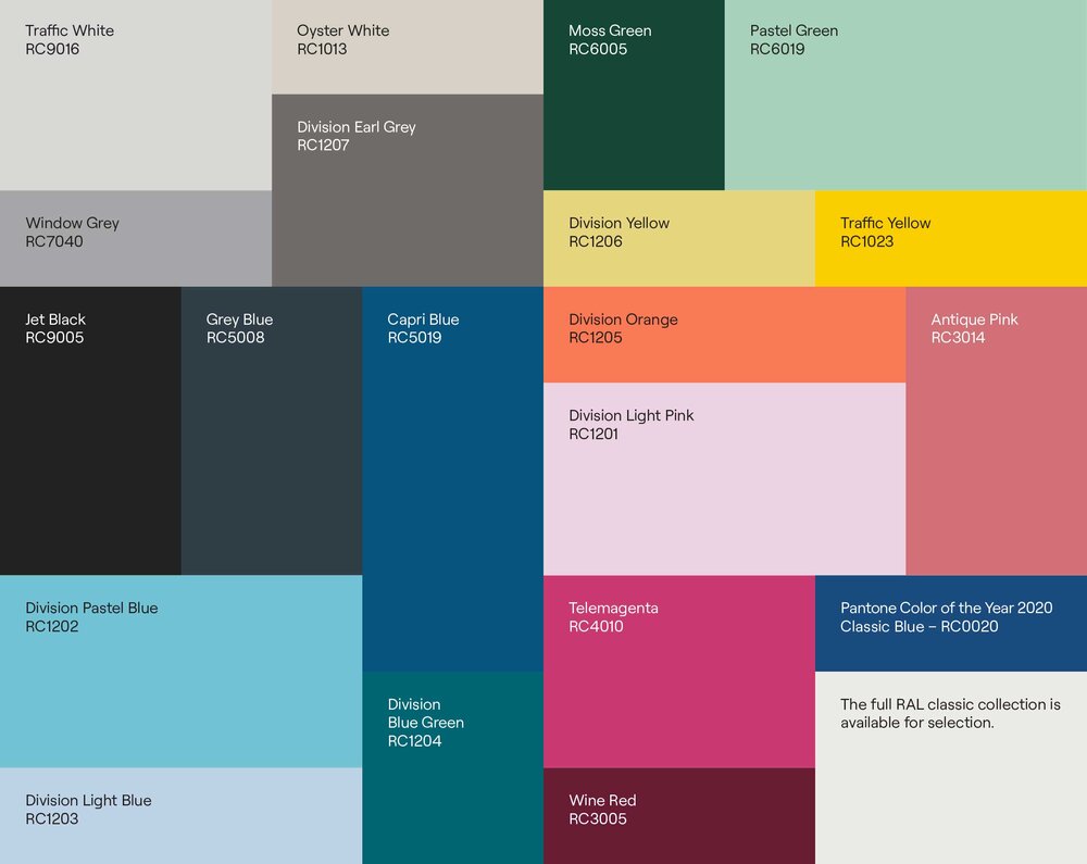
Division Twelve’s palette is ambitiously vibrant with 21 colour options. So far, traffic yellow and teal are outselling the neutral shades. Photo courtesy of Kielhauer
Colour is also finding its way into the built environment with more frequency. In most major cities dominated by glass, steel and concrete skyscrapers, the public realm has become a crucial respite of open space and a place for visual stimulation. Intense bursts of colour are a natural anecdote for breaking through all that urban greyscale.
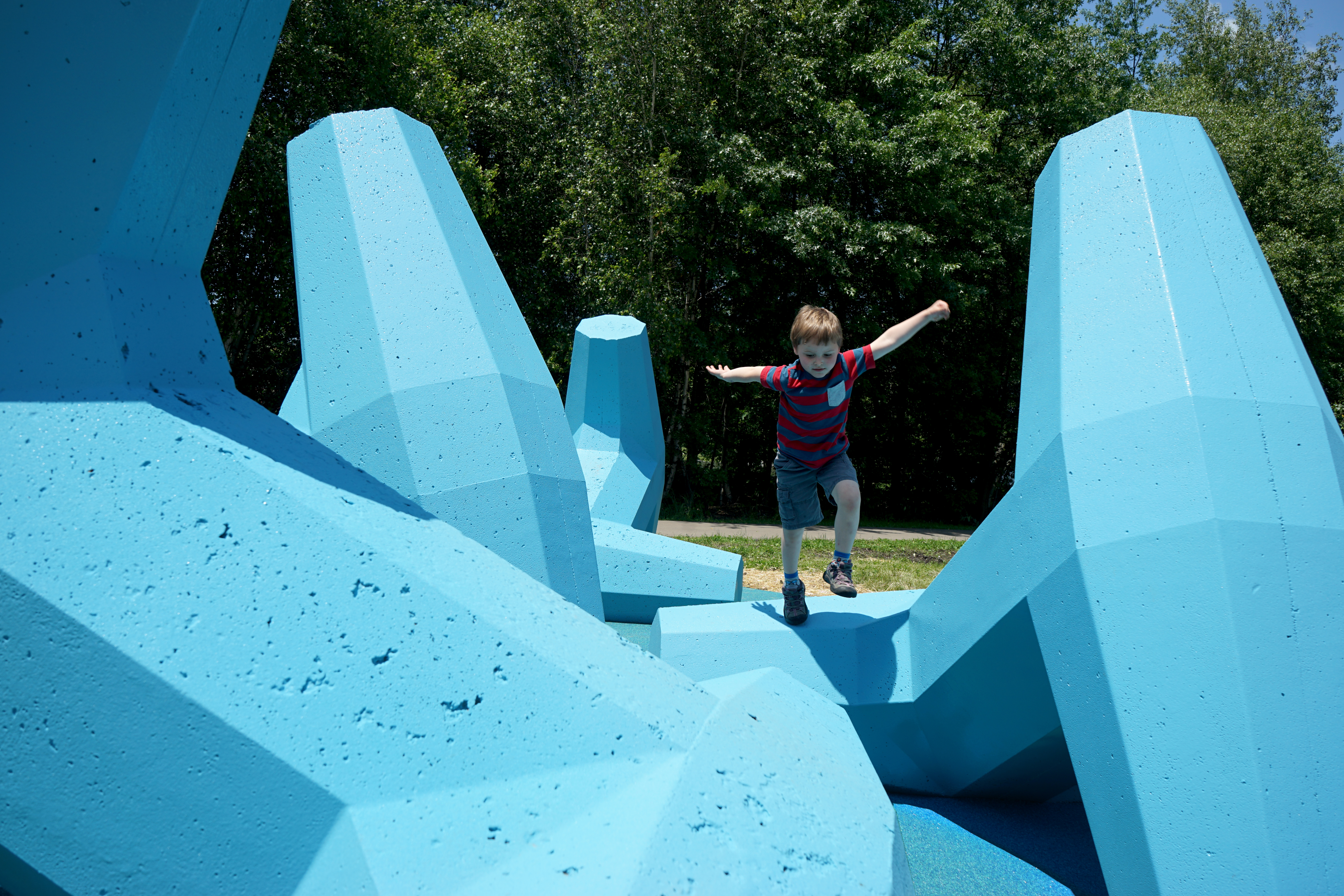
Breakwater by Julia Jamrozik and Coryn Kempster uses colour as an essential tool for bringing people together. Bright hues tend to make us more comfortable talking to strangers. Photo courtesy of CKJJ
Designers Julia Jamrozik and Coryn Kempster, who run their multidisciplinary practice CKJJ in Toronto and Buffalo, use colour regularly as a key component of their work within the public realm. For Breakwater, a playsculpture located in Jamestown, New York, the duo applied a blue-tinted polyurea to four dolosse — those geometric concrete forms used to stop shoreline erosion. The installation’s cerulean vibe is what attracts people to the piece and what invites kids to climb all over them. “To create social spaces where people will interact,” says Kempster, “we have built up a tool kit for things that can enable that, and colour is one of them.”
Most importantly, he adds, “colour tends to bring people together and make strangers more comfortable talking to one another.” That sounds like an ideal anecdote during a time of crisis. Colour may not be life-saving but it does have a positive effect on our moods, emotions and behaviour. In a post-pandemic world, it could very well become a powerful tool for bringing us back together again.
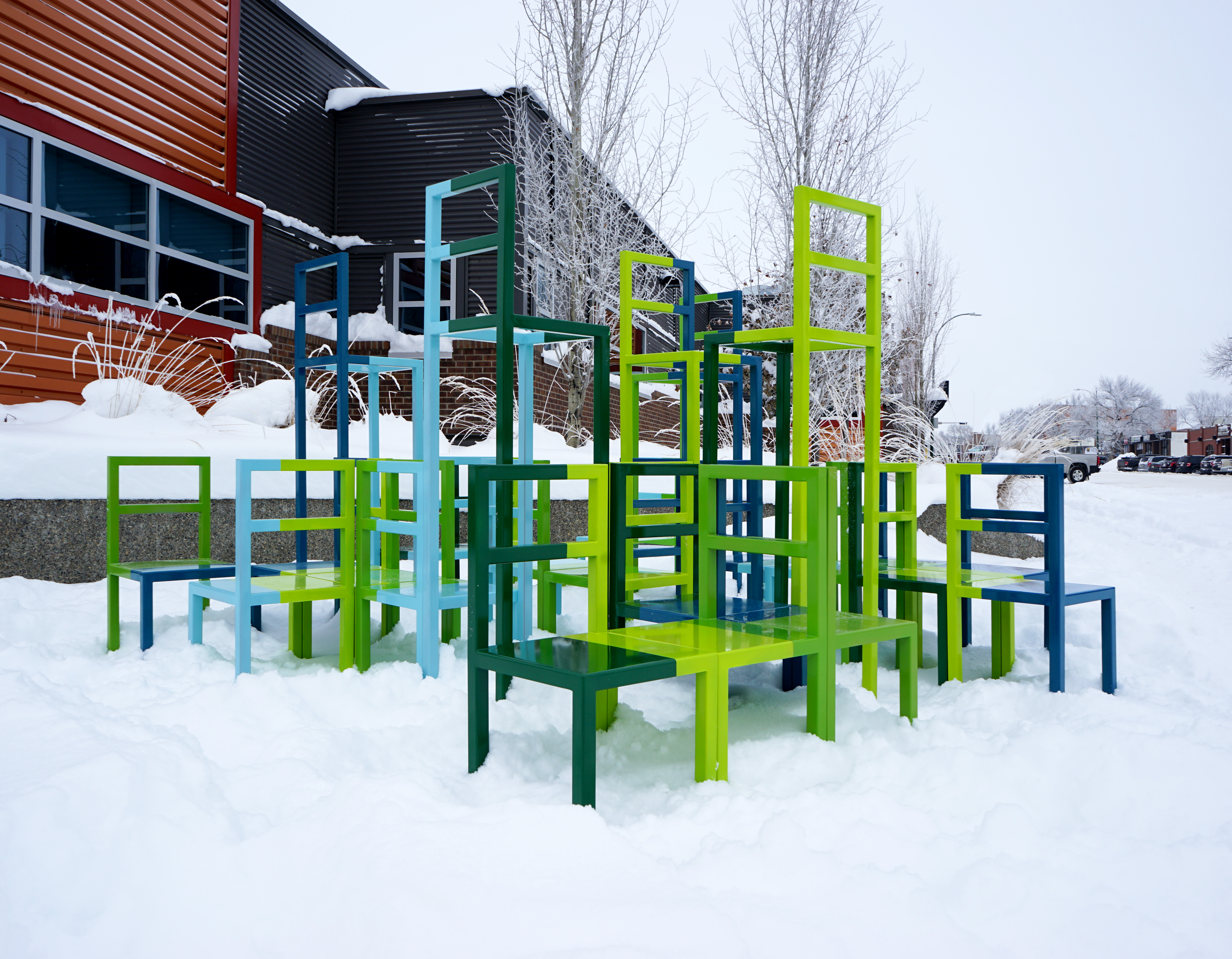
Chair-like structures form a climbable sculpture by CKJJ. Commissioned by the Allied Arts Council of Lethbridge, Alberta, the installation is intended to suggest harmony and togetherness. Photo courtesy of CKJJ
Written by Catherine Osborne